Case Study
Toll Road Services for the Masses
The largest tolling highway in North America moves their services to mobile after decades spent shipping monthly invoices to their users through the traditional physical mail channel.
Back to home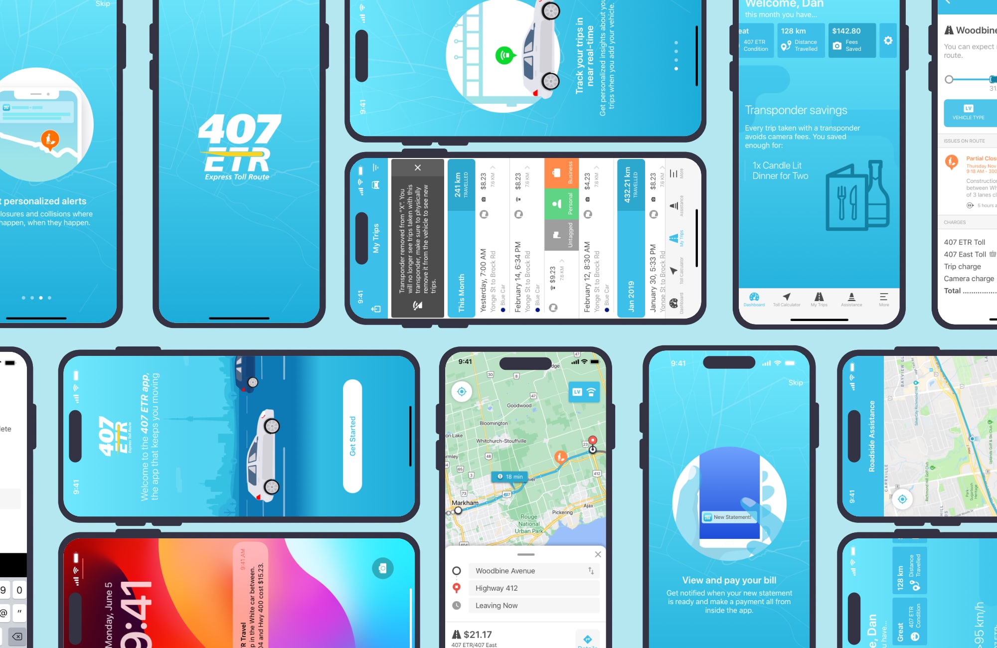
Project Overview
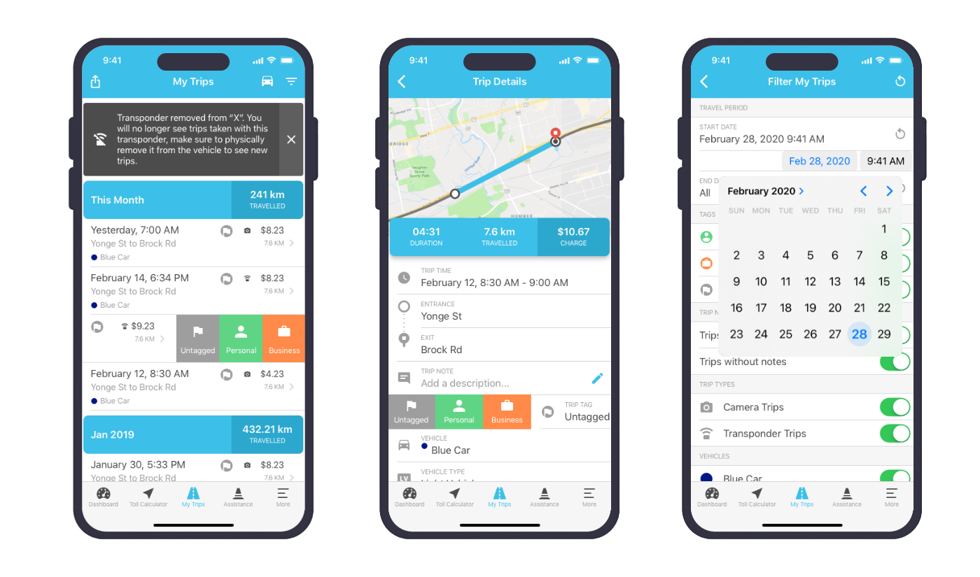
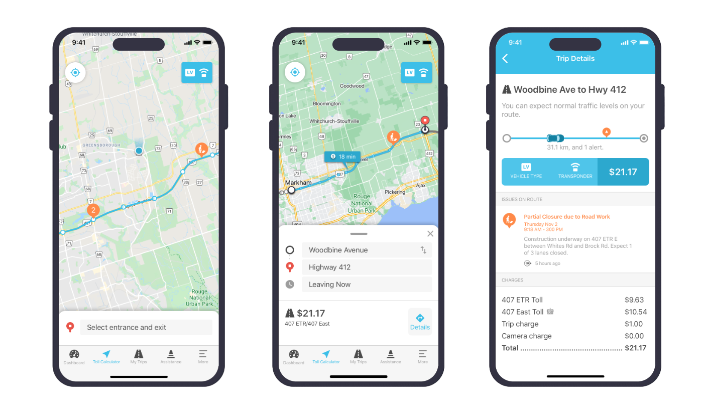
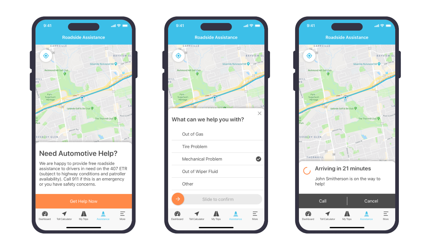
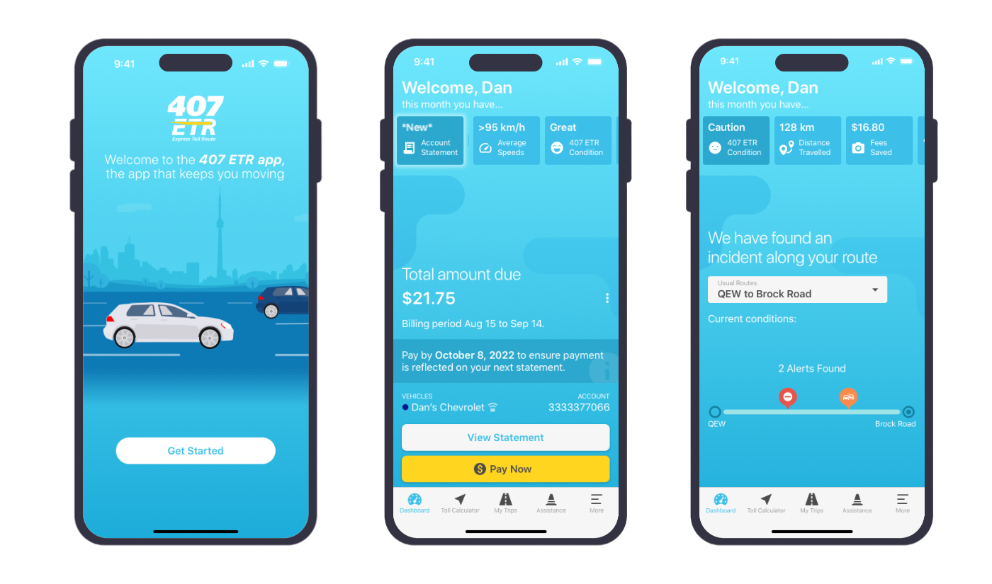
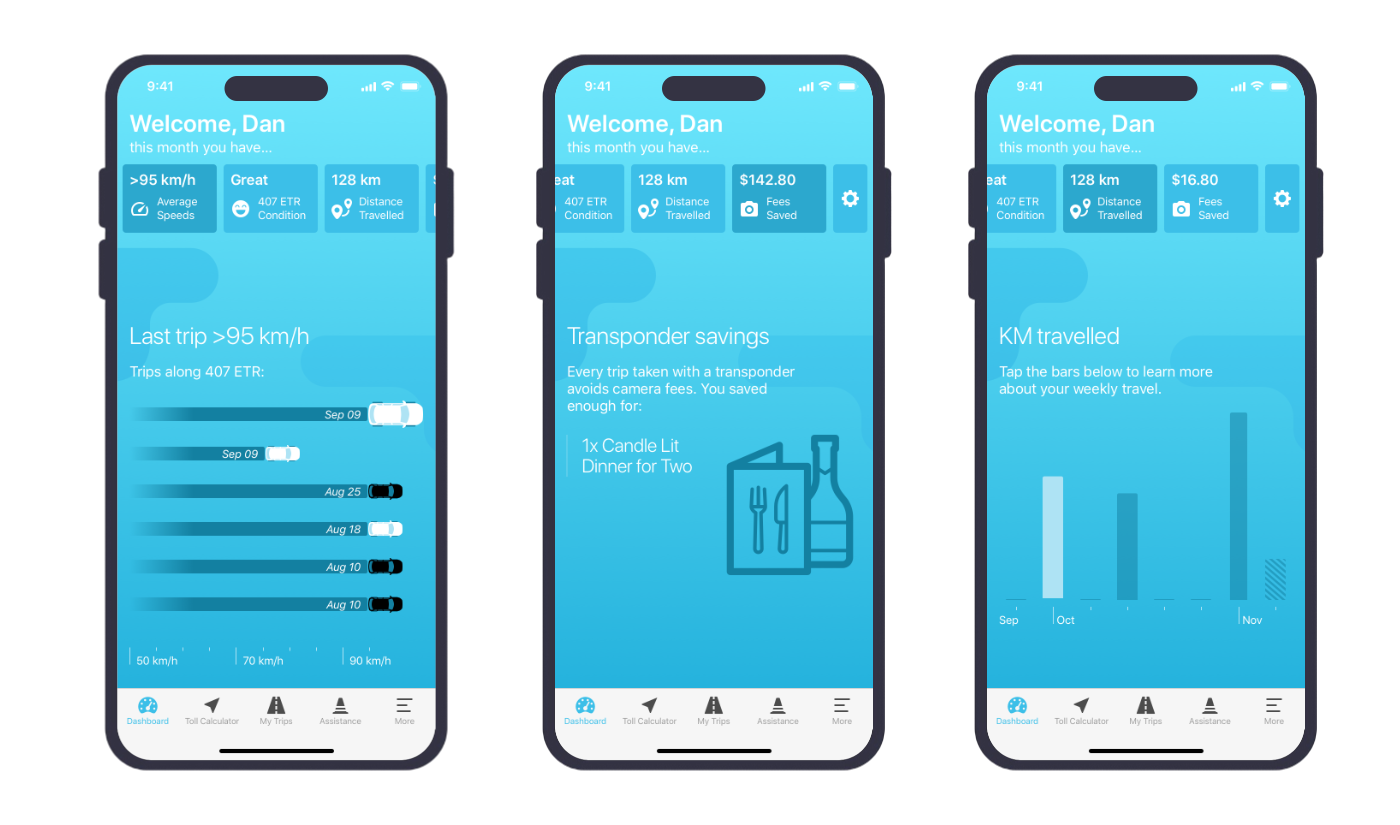
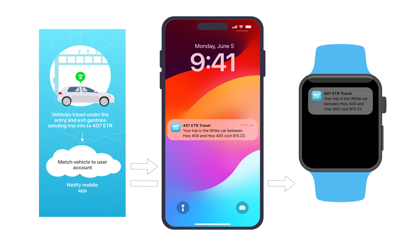
407 ETR approached us to help them take their existing mail based service to mobile platforms. They wished to create a new direct communications channel with their user base through an service industry leading mobile application. Prior to this communication was done through mailed monthly paper statements, their call centre, or through their web portal generally only received traffic from users after they received a mail statement. A major goal for this project was to create an application which would entice users to regularly return between statements creating a new higher touch connection.
This project which included both native iOS and Android versions interacting with the internal 407 ETR backend, was executed in weekly sprints with the first iteration of the application launching in the first 6 months. The application was continuously improved and extended over the course of a 5 year period of our involvement.
My Role
During the course of this project my role evolved from initially functioning as the sole designer and strategist, and transitioned to me leading a project team of 3 developers and 4 designers. My responsibilities included architecture oversight, creative direction, user interaction design, user research, client relationship management, and project management. The agile project was run in sprints with our team connected with 407 ETR at the start of each sprint to break out deliverables at a high level, then taking our items to own internal sprint board for breakdown and execution, and finally delivering completed work to our client for each sprint demo.
In a project such as this one with a complex service system, the need to understand not only the internal product offering but also the intricacies of their users required us to work closely with their internal teams connecting on a daily basis, and also to perform regular user research and testing sessions. The research sessions were done in a combination of one-on-one sessions, group sessions, and online surveys.